Paired Programming Challenge
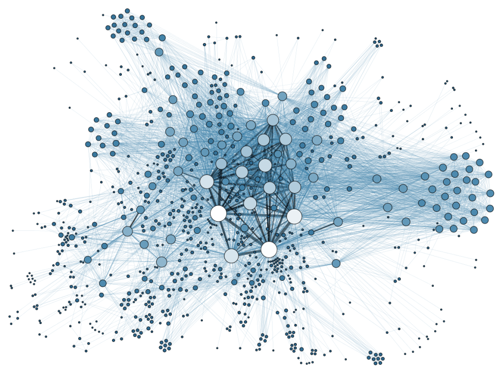
Create data-driven art (including animations and visualizations) using datasets (csv, json) or data from a REST API.
Data selection:
- Understand your data (layout, column names (keys), values)
- For csv/json: Use no more than 3 columns of data (talk to an LA if you want to do more)
The process:
- Think about the goal of your art/visualization. In a sentence or two, write what your code will accomplish. For example, “Illustrate extinction risk using pixelation scaled by the remaining number of a species. This should allow the user to understand, at a glance, how many or few individuals of a species are left in the world.”
- Play with your data. Practice indexing dictionaries and lists! What does the data look like when you draw it as a series of randomly placed circles? A line that follows a trend? How can different points of data be incorporated into a pygame object/shape/graphic?
- Sketch your goal! Take the time and draw out what you’ll be doing. You will submit this for full credit.
- Think of functions (or methods!!) that will draw or animate your data based on the data set. For example, if using a Twitter API, you can create a function that looks for certain words “sad”, “happy”, etc. Then draw bubbles with the radii controlled by the number of times that word has been found.
- Think of the layout–do you want to show all the data at once? One at a time? Different data corresponding to different features of an image?
Your script should:
- Use at least one class and object
- Consider using the downloaded data as an attribute
- Use a dataset: the data can be a downloaded dataset or realtime through use of an API
- Clearly illustrate some data in a creative way (try not to use graphs/charts) OR
- Help improve access to some data or tool (sound-oriented data for blind, visualizations for deaf, easy to read/navigate for elderly & young, share hard-to-find data for the imprisoned/homeless/differently abled)
- Have good composition (use of space and color), that is color-blind friendly (coolors.co).
- Be saved as:
PC10_API.py
Be sure to include:
- Sketch of layout/visualization & pseudocode
- .csv file (if used)
- .py file
- .gif files (if used)
Extra:
- 2 pts – Get creative! – how can you illustrate information without thinking of charts & graphs?
- 2 pts – Social impact A – how can you make a visualization that illustrates a social or environmental issue (ex: who do you NOT see programming? (deaf, blind, LGBTQ+, felons) How has gender and race demographics in tech changed over the years? what about foreign disinformation in social media? e-waste over the years? blood minerals/batteries? contributions of tech to CO2/climate change?)
- 2 pts – Social impact B – Is this visualization modified for differently abled & disabled (sound-based information, no clicking (mousing over?))
- 2 pts – Compare and contrast two different data sets
- 2 pts – Make the visualization interactive (click on an object and something happens…)
Resources:
APIs (Links to an external site.)
Want to try out an API and look at the dataset? Try this API checker script (instructions will print).
API demo video (10 min)
API script walkthrough – no demo(20 min)
Digging into 3D design!
Greetings, my curious companions! It has been a while since I have last posted. Most of this is due to the aforementioned accident, but also because I have been dipping a toe–no, more like cannonballing into 3D design. The latest stage of my research has brought me to building effectively levels of video games for…
Wrecking the Starship
I have a car, a 2000 Jeep Cherokee called The Starship Giggles. It’s my pride and joy. It boasts a 3″ lift, 33″ tires, and a rather delightful sound system, assembled by yours truly. Well, that darling truck of mine was run it off the road today. It is important to realize–for myself, and for…
The Smell of Lightning
For many, springtime on the East Coast means the welcome of thunderstorms. We had our first big storm yesterday, with window-shakingly close lighting strikes. One lightning strike was so close my office was filled with a pungent smell for about 15 minutes afterward. I love the smell of lightning, or more accurately, ozone. So, naturally,…
Can’t find what you’re looking for? Use the search form to search the site.
Get new content delivered directly to your inbox.


